
Storage & Distribution.
Warehousing & Transport.

Identity
We created a custom hand lettered wordmark for the parent company name as well as a monogram.

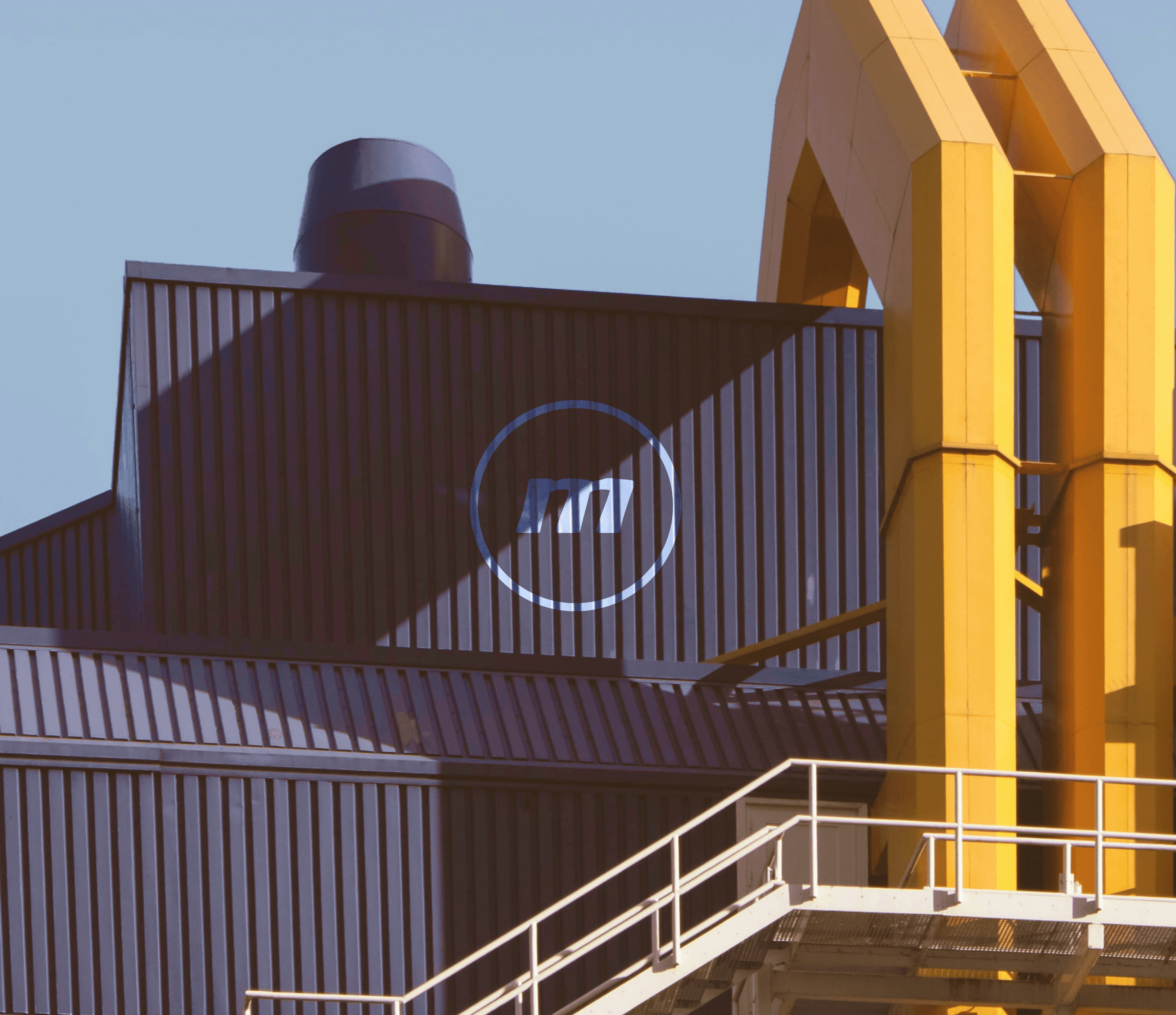
Secondary Colour
We kept the original blue respecting the legacy of the company. However we also introduced a secondary yellow colour to bring in flexibility/optionality when it came to marketing and communication.

We developed two internal marks from the parent monogram to encourage team work, ownership and belonging within the companies two core functions (storage and distribution).


Internal Teams
Since the team marks were only for internal use we went with modified monograms. Distribution represented by the arrow (signifying motion and movement) and storage using a more stationary looking triangle (the three sides representing warehousing, handling and management).

